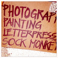
 I'm a letterform junkie. I snap photos of letters that catch my eye. I buy stencils just because. I can't look at a sign without thinking about the font choice and letterspacing. I keep scraps of found type in my filing cabinet — seriously, I just gave another designer a greasy french fry bag that I've saved for years! This is one reason I've loved print design so much and have been less interested in web design.


The internet has been dominated by the few fonts that Microsoft has included in Internet Explorer: Arial, Times New Roman, Verdana, and Georgia — none compelling and for the most part derivative of the superior designs that inspired them. CSS2 tried to remedy this by allowing specification of the types of fonts such as serif, san serif, monotype, etc, but that didn't guarantee that the font I selected as a designer would be the one viewed by the reader. This gets extremely frustrating when menus or columns no longer align due to letter space differences.
But suddenly the Internet is getting interesting to me again due to more broadly adopted font distribution technology that is the equivalent of streaming music. As a designer I can now specify a font for my site and it will stream to your computer, temporarily residing in your browser without requiring it to be downloaded into your system. When you close out your browser it's gone.
This means I can choose Berthold Akzidenz Grotesk instead of Arial. That's beautiful to me. To build on a recent quote from Ellen Lupton, it's like choosing the right bulbs for your living room — cool fluorescents just don't do it for me. I plan to try this out here on the blog soon. You can read more about this (and read Ellen's quote) in the LA Times.